Kerning in Resumes - Advanced Formatting Issues in Microsoft Word
Hammer and Nails
When you have a hammer, every problem has a nail that needs to be nailed down.
Kerning is my hammer, and all the spacing issues in my standard Georgia typeface are the nails.
For those unfamiliar with kerning, let me block quote an explanation from Wikipedia and share an example image.
In typography, kerning is the process of adjusting the spacing between characters in a proportional font, usually to achieve a visually pleasing result. Kerning adjusts the space between individual letter forms, while tracking (letter-spacing) adjusts spacing uniformly over a range of characters.[1] In a well-kerned font, the two-dimensional blank spaces between each pair of characters all have a visually similar area.

Kerning in Microsoft Word
So how can you solve kerning issues in Microsoft Word?
The foolproof way is to make your PDF a collection of images, so that the image presents the same way every time, irrespective of the engine rendering the PDF. Just don’t forget to hide actual text underneath the image in case a robot is reading your resume.
The real way is to adjust the kerning in Word itself. In my experience, the automatic method didn’t make any difference to me and the manual method was the only way to achieve the result I wanted.
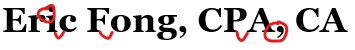
Let’s start with my resume header (using the Georgia font) - do you see the issues?

The biggest offender are the commas, one is clearly separated from the preceding letter and the other is adjacent to the serif of the capital A.
I run Microsoft Word 2016, but the method of applying kerning is the same for all versions of Word since 2011.
Automatic Method
If you’re an advanced user of Word and the text is already formatted using one of the Styles (e.g. the bar that lets you choose Heading, Emphasis, Strong, etc.), then right-click that Style, hit Modify, click the drop-down for Format in the bottom left, select Font. In the new window that opens, go to the Advanced Tab, and check off Kerning for fonts:, ensuring the font you want adjusted is greater than the number to the right of that item.
If you’re not using Styles, then I recommend taking CS 200 if you’re a student at the University of Waterloo. Highlight the text you want to automatically kern, press CTRL + D to bring up the font box, go to the Advanced Tab, and check off Kerning for fonts:, ensuring the font you want adjusted is greater than the number to the right of that item.
Did you notice a difference? I didn’t, my examples above looked the same with or without the automatic kerning.
Manual Method
That didn’t work for me, so it’s hammertime.
- Highlight the two letters adjacent to the spacing you want to adjust
- Press Ctrl+D to bring up the Font menu
- Go to the Advanced tab, make sure that Kerning for Fonts is unselected
- Under the section Character Spacing, adjust the number in the By: box beside Spacing: using the arrows (down for closer, up for further apart)
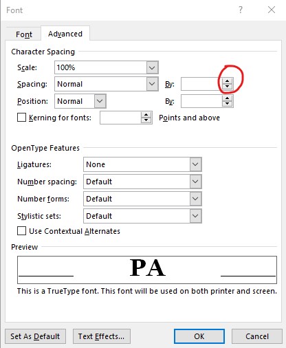
- The box on the bottom will show you a preview as you adjust it, increase or decrease the kerning until you’re comfortable with it
- Remember what the values are. Don’t hit Ok, instead hit Cancel
- Highlight the letter left of the kerning you want to adjust, and open the Advanced tab in the Font box again
- Enter the spacing setting from Step 6, and hit Ok
- Repeat this for each spacing you want to adjust - if you don’t need a preview, you can directly adjust the kerning by highlighting just the letter to the left of the space you want adjusted.
That’s it!
Looks better than it did before.

Will anybody even notice? Probably just me.